Data structure
Data shown in charts and tables is always structured in tables in the background. The difference is, how the dimensions are concatenated in the visualization. To understand which data points are shown to you, keep in mind that configured dimensions and KPIs will be structured in the background in the following way:
| Dimension 1 | Dimension 2 | ... | KPI 1 | KPI 2 |
|---|---|---|---|---|
| A | 01 | ... | 2 days | 10k |
| B | 01 | ... | 5 days | 100 |
| B | 02 | ... | 0 days | 3k |
| ... | ... | ... | ... | ... |
OLAP table
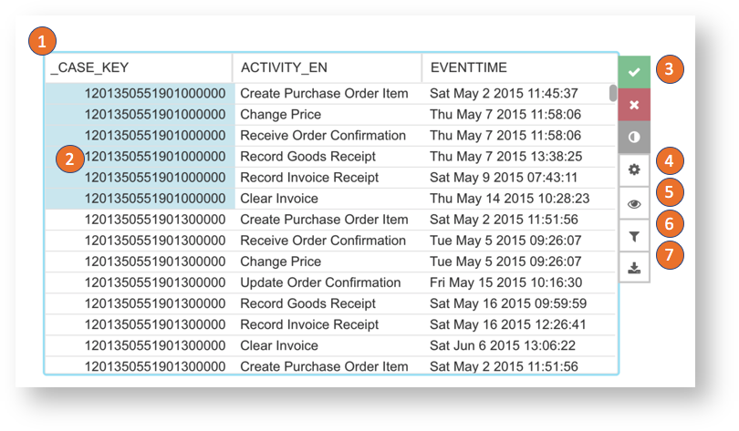
The OLAP table will show all dimensions and KPIs configured in a table:
- The dimension and KPI name are shown in the column headers. Click on the header to change the table sorting or search in the dimension columns.
- Click on a dimension and create a selection. Selected entries can be copied to the clipboard by right click and the available action.
- Confirm, cancel or invert the temporary selection.
- Open the component settings. (Only available in the analysis draft)
- Hide and show dimensions and KPIs.
- Open the component filter. (Only available in the analysis draft)
- Download the component.
Column, line, area and marker charts
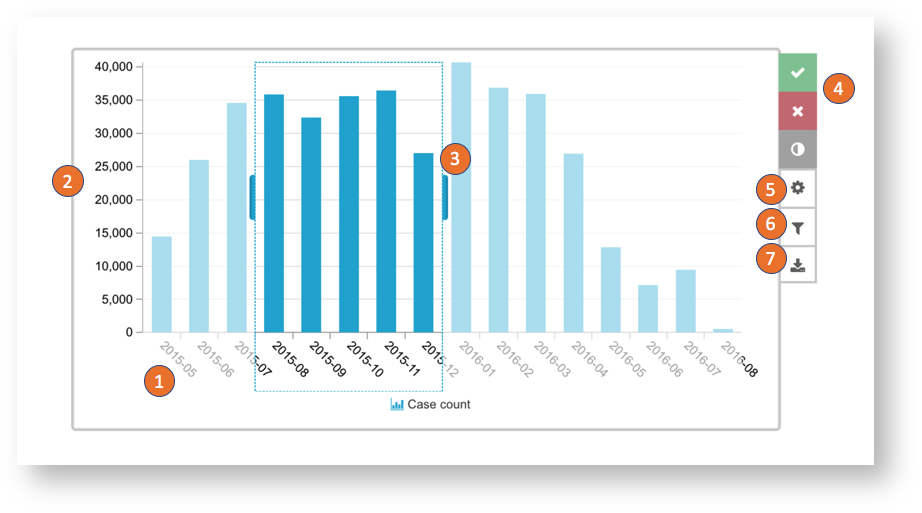
Column, line, area and marker charts all behave the same with the visual representation beeing the only difference:
- Dimensions are concatenated and shown on the dimension axis.
- KPIs are by default all shown on the primary value axis.
- Click on the chart and drag and drop to create a selection.
- Confirm, cancel or invert the temporary selection.
- Open the component settings. (Only available in the analysis draft)
- Open the component filter. (Only available in the analysis draft)
- Download the component.
Pie and Donut chart
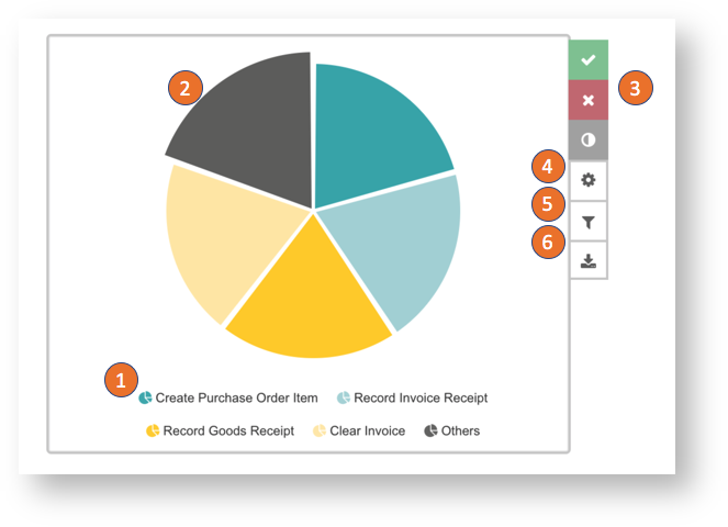
Pie and donut charts both show the concatenated dimensions as pieces and the size of each piece is defined by the first KPI.
- The currently visible dimensions are shown in the legend by default.
- Click on a piece to create a selection.
- Confirm, cancel or invert the temporary selection.
- Open the component settings. (Only available in the analysis draft)
- Open the component filter. (Only available in the analysis draft)
- Download the component.
Bubble plot
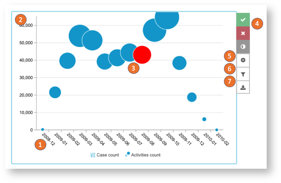
The bubble chart shows exactly two KPIs over a selected dimension.
- The dimension you configure will be shown on the horizontal axis.
- The first KPI will be displayed on the vertical axis.
- The bubbles are rendered on the chart. The size is defined by the second KPI. Klick on the bubble to create a selection on the Dimension.
- Confirm, cancel or invert the selection.
- Open the component settings. (Only available in the analysis draft)
- Open the component filter. (Only available in the analysis draft)
- Download the component.
Histogram chart
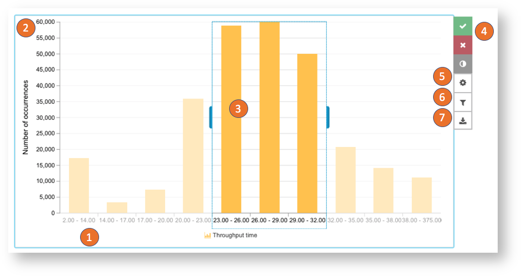
The histogram takes a KPI as an input and shows the case distribution on it.
- The buckets of the KPI are shown on the horizontal axis.
- The number of occurrences is shown on the vertical axis.
- The buckets can be selected by click or drag and drop. After Confirming the selection the selected area will be split up again.
- Confirm, cancel or invert the selection.
- Open the component settings. (Only available in the analysis draft)
- Open the component filter. (Only available in the analysis draft)
- Download the component.
Scatter plot
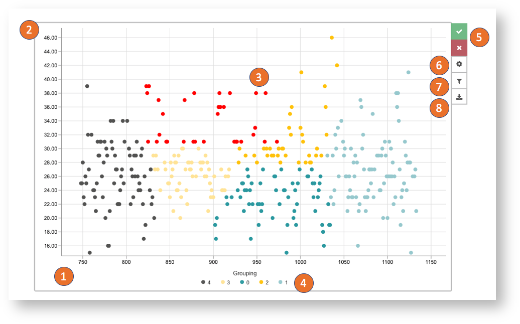
The scatter plot will plot a point for each case or other item you aggregate on.
- The KPI selected for the horizontal axis.
- And the KPI selected for the vertical axis define the position of the elements.
- Click on single points or drag and drop to create a selection.
- You can define a grouping which is used to color the elements. You can click on the groups and create a selection on them.
- Confirm or cancelthe selection.
- Open the component settings. (Only available in the analysis draft)
- Open the component filter. (Only available in the analysis draft)
- Download the component.