The Cropping component implements a Crop Selection a crop selection to your analysis document.
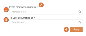
You can select two activities (a starting activity and an ending activity). A Selection A Selection will be created for all cases that pass these two selected activities.

Cropping component
Click on one of both textfields and choose any activity from the list.
| Tip | ||
|---|---|---|
| ||
Just start typing your desired activity into the field. Your list will adopt accordingly. |

The following screenshot shows a sample configuration, filtering for cases passing from "Change Price" to "Delete Purchase Order Item":

Don't forget to save your settings with  .
.
Configuration
The following configuration options are available:

| title | Title |
|---|
The title will appear above the Cropping component in your analysis sheet.

Please specify your desired title into the text field.

After typing in the first characters in the Title textfield, the formatting options will appear right below the textfield.
You may edit your font, its size ,text highlighting, colors (font-, background - and border color) and your text orientation.
| title | Title |
|---|
Cropping cuts off the process graphs before the start activity and the end activity you set.
- Set a start activtiy.
- Define if the first or last occurrence is considered in a case.
- Define the end activity and its type of occurrence.
- Apply the crop selection
Cropping component settings
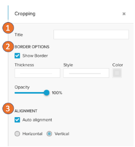
In the dropdown settings you can define:
- A title for the component.
- Hide / show the border and define its layout.
- Choose the layout for the activity inputs.
With ' Auto alignment'
The title will appear above the Cropping component in your analysis sheet.
Please specify your desired title into the text field.
After typing in the first characters in the Title textfield, the formatting options will appear right below the textfield.
You may edit your font, its size ,text highlighting, colors (font-, background - and border color) and your text orientation.
| title | Show Border |
|---|
Activate the Show Border checkbox to surround your component with a border.
You can specify the thickness, style, color and opacity of the borderline.
| title | Alignment |
|---|
Adopt the alignment of your component.
Choose between Horizontal and Vertical (which is selected by default)

Celonis 4 automatically picks the option to fit the available chart area.
