The Single KPI components help you display and keep track of an individual metric of your analysis.
Celonis has four single KPI components: GaugeNumber, Fill, Number Radial, and RadialGauge.
We will explore their differences by comparing how they display information relative to a same KPI Example (explained below).
| Info | ||
|---|---|---|
| ||
The selected KPI for demonstration is the number of cases that flow through the 'Change Price' activity.
|
Number
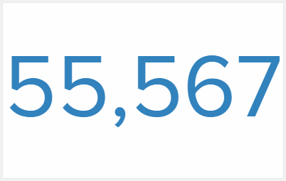
The Number is the most simple Single KPI
component.
It displays only the value of the KPI and changes color automatically as it raises over the defined threshold values.
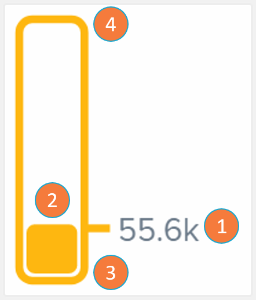
Fill
The Fill component is a bar whose content linearly fills as the KPI value grows closer to the threshold's upper bound. The Fill bar changes color automatically as it raises over the defined threshold values.
- KPI numerical value: value of the single KPI in analysis.
- KPI relative value: graphical representation of how close the KPI is to the defined maximum threshold value.
- Lower bound threshold: minimum value the KPI may have.
- Upper bound threshold: maximum value the KPI may have (in this example: total case count).
Radial

The Radial component is a circle whose content fills as the KPI value grows closer to the threshold's upper bound. The Radial filled arc changes color automatically as it raises over the defined threshold values.
- KPI numerical value: value of the single KPI in analysis.
- KPI relative value: graphical representation of how close the KPI is to the defined maximum threshold value.
- Lower bound threshold (beginning or circle): minimum value the KPI may have.
- Upper bound threshold (end of circle): maximum value the KPI may have (in this example: total case count).
Gauge
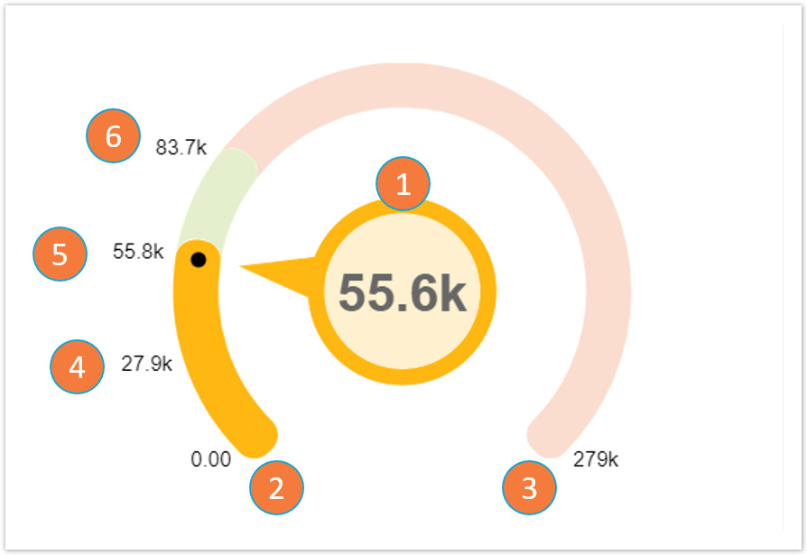
The Gauge component gives a visual display of how close a KPI is to a given threshold dimension.
- KPI value: value of the single KPI in analysis.
- Lower bound threshold: minimum value the KPI may have.
- Upper bound threshold: maximum value the KPI may have (in this example: total case count).
- 10% threshold: since the KPI value is between the 10% and 20% thresholds, the color of the Gauge component becomes one assigned to the 10% threshold.
- 20% threshold
- 30% threshold
The main differentiation point of the Gauge relative to the other KPIs is that it is the only one that exhibits on screen the thresholds set by the user (items 2 to 6). The thresholds are shown both by their numerical value and by the difference in color swatch in the Gauge arc. Each threshold is also positioned on the arc according to its relative value to the upper bound threshold
The data provided by the data sets is organised by the Case Explorer and presented as a table.
Column sort: each of column represents one of the imported columns from the data set. When clicking on a column, it is possible to sort the entire table according to the column content on ascending or descending order.Table Column editor: opens up the table columns panel (see 'Table Columns' section).
Case selector: each row of the Case Explorer table refers to a specific case. The case details panel (see 'Case details' sections) opens when clicking on a row.
Activity table divisor: line determining the division between the core elements of the activity table (case ID, activity and time stamp) located to the left and the accessory elements from the activity table or other linked tables, to the right
.