PI Social
The PI Social screen displays an overview of the activities, performance and characteristics of the users involved in the analysed process.
Set-up screen (first use)
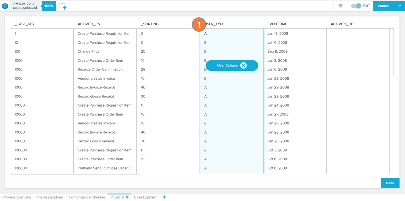 |
The selection of a user column is required to enable the PI Social application. A user column contains the name or identification of the users who performed the activities logged in your Activity Table. When you identify your user column (item 1), simply select it and click on done to proceed.
Overview
 |
 |
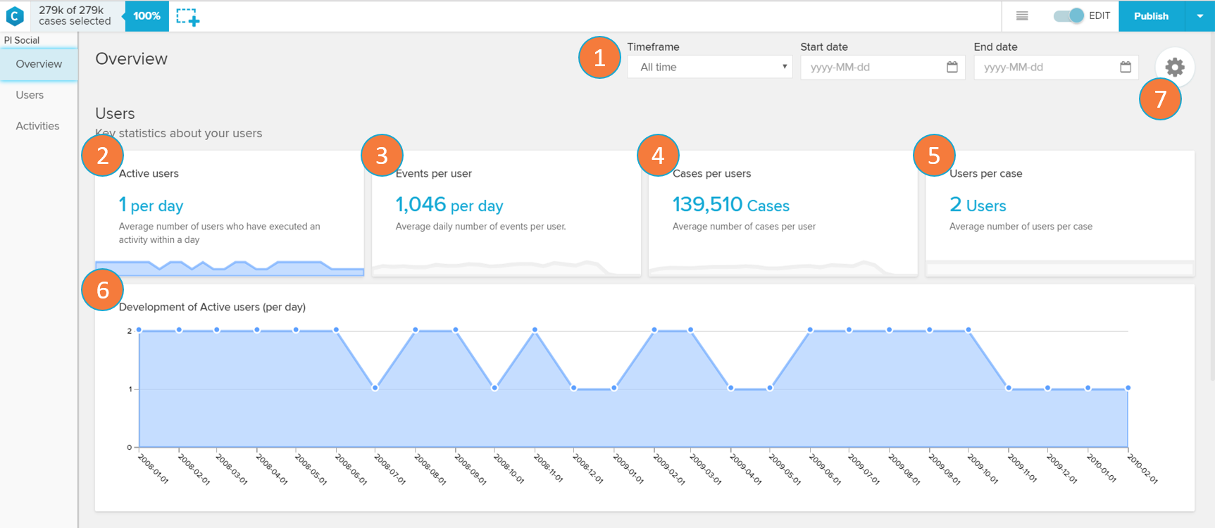
The PI Social overview screen shows general statistics about the users involved in the analysed process.
Timeframe: allows the selection of a specific period of in time in which the analysis overview will be displayed.
Active users: displays the average number of users that execute activities on a day.
Events per user: displays the average number of events a user is involved in per day.
Cases per user: displays the average number of cases a user is involved in per day.
Users per case: displays the average number of users involved per case.
Trend Chart - Development of active users per day over selected time frame : the trend chart displays the cases per day over the time frame. By clicking on the 'Active users' (item 2), 'Events per user' (item 3), 'Cases per user' (item 4), or 'Users per case' (item 5) card, the chart updates to display the history trend of the selected card.
Users: routes the application to the User screen (see 'Users' section below).
Users
 |
If a user circle is selected (see 1)
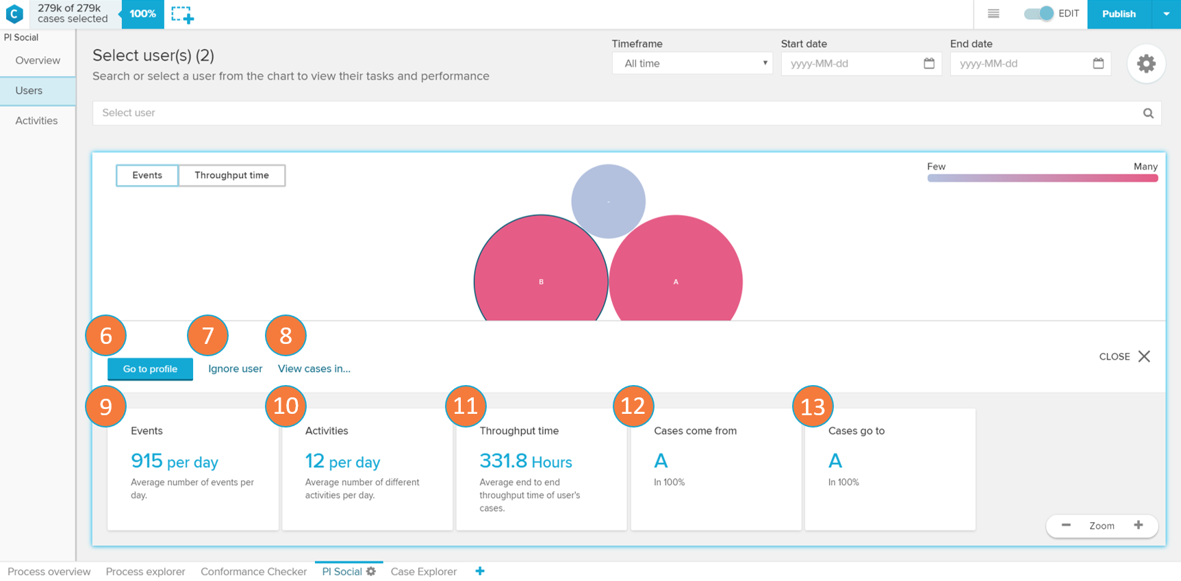 |
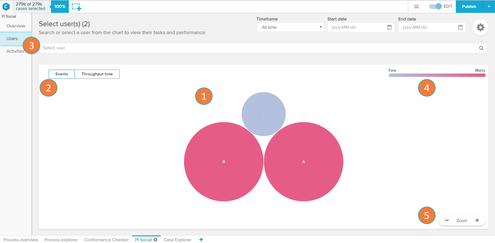
The User screen allows you to visualise differences on your analysis users and select them for further inspection.
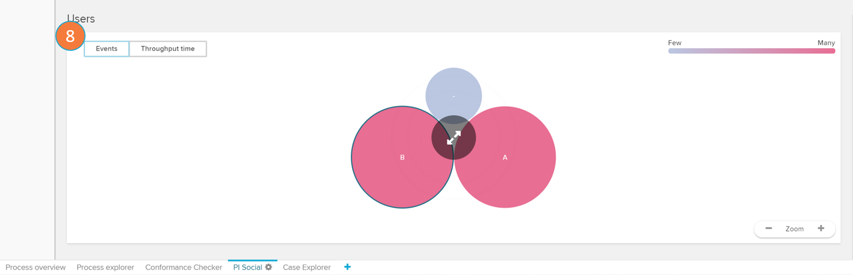
User chart: each circle on the user chart represents a user that executes an activity in the analysed process. The size and tone of the circle are associated by default with the event count of each user (the bigger and darker the bubble, the higher the count). By clicking on an User Circle, you are able to see metrics or filter your analysis to this user (see 6 to 13).
Metrics toggle: alternates the metric used to calculate the User Circle size and colour between event count ('Events') and average throughput time ('Throughput time').
User selector: dropdown selector for searching and selecting a user in order to open his user profile (see 'User Profile' section).
User circle color scale: the scale explains the color gradient of the user circles. The lighter the tones, the fewer events or per day or throughput time are associated to a activity.
Zoom: allows the user to zoom out (' - '), zoom in (' + ') or reset the zoom (hover the mouse over the 'Zoom' keyword to visualise the 'Reset' button) of the User chart.
Go to profile: opens the selected user's profile (see 'User Profile' section)
Ignore user: removes the cases involving the user from the analysis.
View cases in: filters the cases to the ones involving the selected user on other tabs of your analysis.
Events: daily average number of events with the selected user.
Activities: average number of different activities the user executes per day.
Throughput time: average time it takes to complete the end to end activities the user executes.
Cases come from: displays the most common user whose activities precedes the ones of the selected user and the relative frequency (in percent) this happens.
Cases go to: displays the most common user whose activities come after the ones of the selected user and the relative frequency (in percent) this happens
User Profile
 |
 |
 |
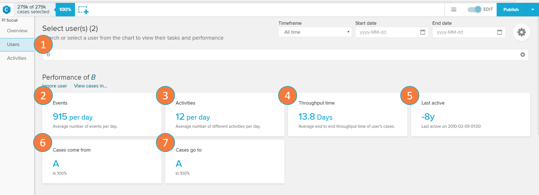
The User Profile screen show performance metrics and graphs of a selected user.
User selector: change current user whose profile is being visualised or cancel the selection.
Events: daily average number of events with the selected user.
Activities: average number of different activities the user executes per day.
Throughput time: average time it takes to complete the end to end activities the user executes.
Last active: shows how long ago did the user perform his most recent activity.
Cases come from: displays the most common user whose activities precedes the ones of the selected user and the relative frequency (in percent) this happens.
Cases go to: displays the most common user whose activities come after the ones of the selected user and the relative frequency (in percent) this happens
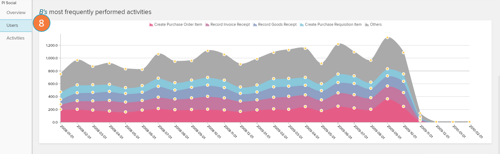
Trend chart - User's most frequently performed activities over the selected time frame : displays the development of the number of cases the user executed on his most performed activities over a period of time.
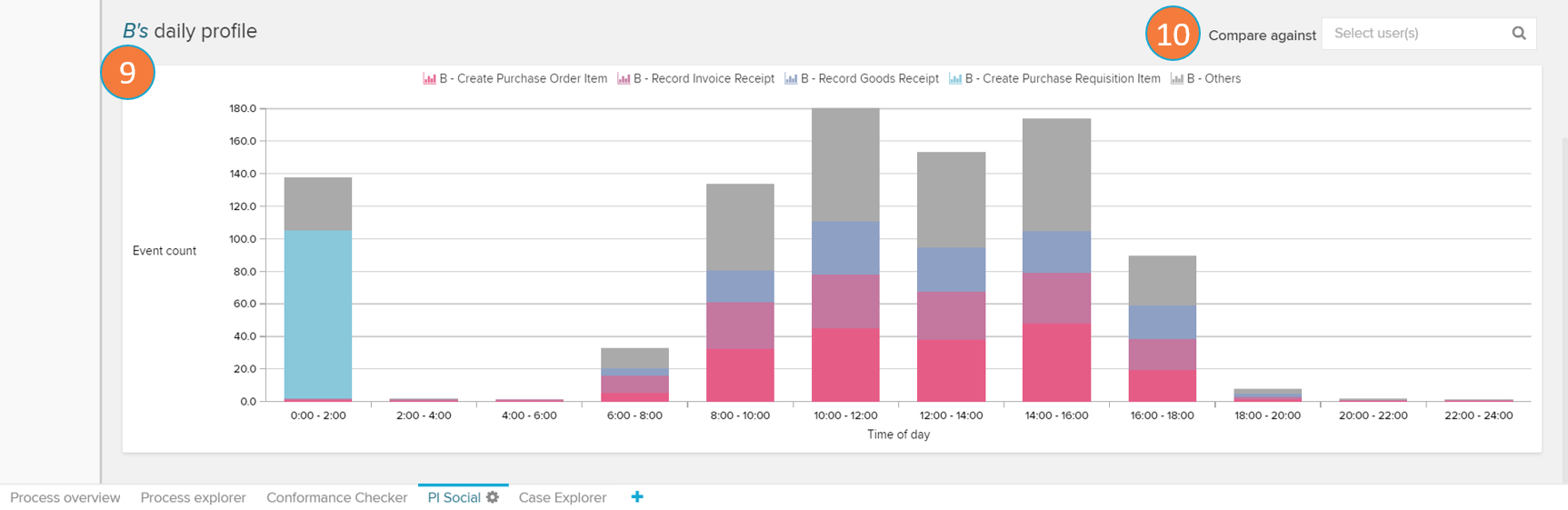
Daily profile chart: the chart displays a histogram with the average event count on the user's most performed activities according to the part of the day in which they occur.
Compare against: allows the selection of another user (to be added as a trend line) to be used as a basis of comparison in the Daily profile chart.
Activities
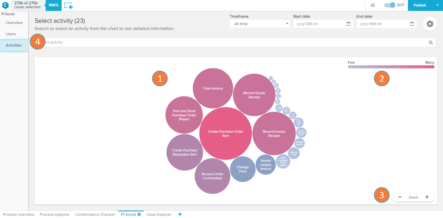 |
If an Activity Circle (see 1) is clicked
The Activities screen shows the most frequent activities in the current case selection.
Activities chart: each circle on the activities chart represents a certain activity that occurs in the analysed process. The size and tone of the circle are associated with the frequency of events per day in which this activity occurs (the bigger and darker the bubble, the higher the frequency). By clicking on an Activity Circle, you are able to see metrics or filter your analysis to this activity (see 5 to 8).
Activity circle color scale: the scale explains the color gradient of the activity circles. The lighter the tones, the fewer events per day are associated to an activity.
Zoom: allows the user to zoom out (' - '), zoom in (' + ') or reset the zoom (hover the mouse over the 'Zoom' keyword to visualise the 'Reset' button) of the Activities chart.
Activity selector: dropdown selector for searching and selecting an activity in order to open its activity profile (see 'Activity Profile' section).
Go to activity profile: opens the activity profile of the selected activity circle (see 'Activity Profile' section).
View cases in: view the selected activity circle activity on other tabs of your analysis.
Event count: daily average number of events with the selected activity.
Number of users: displays the number of users who execute this activity per day.
Cases come from: contains the activity that most commonly precedes the selected activity, and the relative frequency (in percent) this happens.
Cases go to: contains the activity that most commonly proceeds the selected activity, and the relative frequency (in percent) this happens.
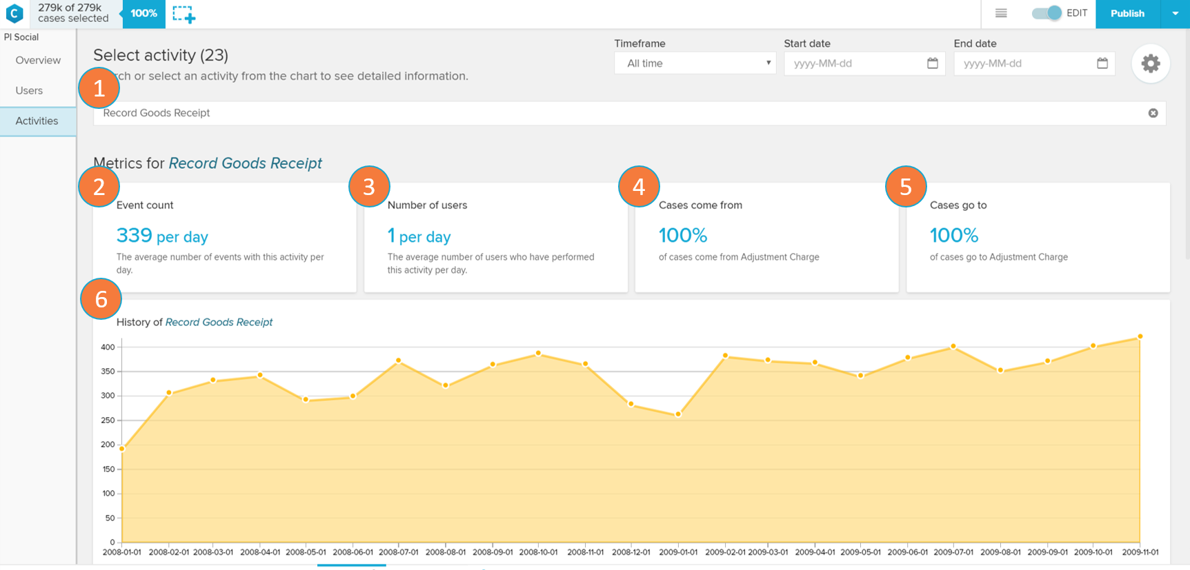
Activity Profile
 |
 |
 |
The Activity Profile screen shows metrics and graphs on a selected activity.
Activity selector: change current activity whose profile is being visualised or cancel the selection.
Event count: daily average number of events with the selected activity.
Number of users: displays the number of users who execute this activity per day.
Cases come from: contains the activity that most commonly precedes the selected activity, and the relative frequency (in percent) this happens.
Cases go to: contains the activity that most commonly proceeds the selected activity, and the relative frequency (in percent) this happens.
History chart: the chart displays the trend for the average event count per day for this activity through different months.
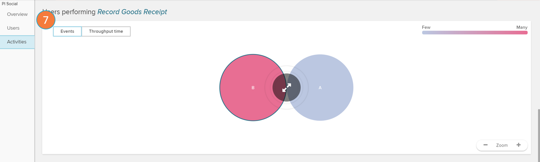
Users performing: opens up the user panel (see 'Users' section) filtering only the users that perform the selected activity.
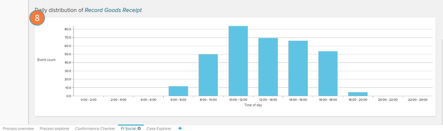
Daily distribution chart: displays a histogram with the average event count of the selected activity according to the part of the day in which they occur.